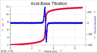
Different columns often contain values of widely varying ranges. For example, in a standard acid-base titration experiment, you often cannot get a good view of both the pH and derivative data on a single graph because fully accommodating one column of data on a graph may result in an indecipherable straight line for the other column. To get a good view of both column plots, despite their varying ranges, you can add a second y-axis to the right-hand side of the graph. The new y-axis will have its own scaling, independent of the scaling of the y-axis on the left side of the graph.